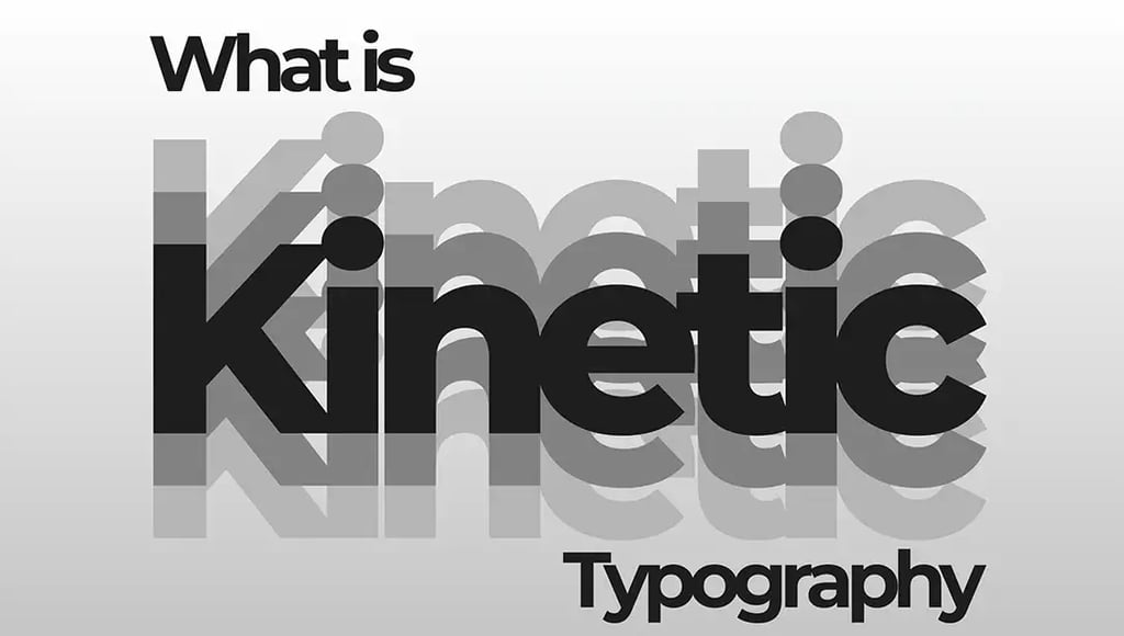
What Is Kinetic Typography?
Let's cut to the chase: kinetic typography works. Not in some abstract, theoretical way, but in measurable, bottom-line-affecting ways that make CMOs and creative directors actually pay attention. Words that move don't just look cooler than static type, they fundamentally change how people process, remember, and respond to information. And in an era where everyone's fighting for scraps of attention in oversaturated feeds, that difference matters enormously.
Your Brain on Motion
There's real neuroscience backing this up. Our visual system evolved
to detect movement because things that moved were either trying to eat
us or could be eaten by us. That ancient wiring still exists, which means motion captures attention whether we want it to or not. When type moves through our field of vision, our brains literally cannot ignore it the way they can ignore static elements.
But here's where it gets interesting: it's not just about grabbing eyeballs. Studies on multimedia learning have shown that information presented through multiple channels, visual and kinetic in this case, gets encoded more deeply than information from a single channel. When you watch kinetic typography, you're not just reading words. You're processing motion patterns, timing, spatial relationships, and often audio cues simultaneously. All of that creates multiple memory hooks.
Research from cognitive psychology shows that movement can enhance recall by up to forty percent compared to static presentation. Think about what that means for a brand message or a key product feature. The difference between someone vaguely remembering your content and actually retaining it can be the difference between a scroll-past and a conversion.
Emotion Through Motion
Here's something most people underestimate: motion carries emotion. The way something moves makes us feel things, often subconsciously. Aggressive, sharp movements create tension and urgency. Smooth, flowing motion creates calm and elegance. Bouncy, elastic motion feels
playful and accessible. Slow, weighty movements convey importance and gravitas.
This emotional layer is incredibly powerful because it operates beneath rational thought. Someone might not consciously think "that brand feels innovative" when they see kinetic typography with precise, geometric movements. But they'll feel it. That perception gets
attached to the brand at a level deeper than explicit messaging ever reaches.
We see this constantly at Ultratype when we're working with clients. The same words animated two different ways can communicate completely opposite emotional tones. "Innovation" moving with sharp, quick precision feels like cutting-edge technology. The same word flowing with organic, fluid motion feels more human-centered and approachable. Neither is better, they're just serving different strategic goals. But both are infinitely more emotionally resonant than static type
The Attention Economics Argument
Let's talk about the brutal reality of modern content consumption. The average person is exposed to somewhere between four and ten thousand brand messages per day. Most of them are completely forgotten within seconds. In that environment, being merely good isn't enough. You need to be impossible to ignore.
Kinetic typography solves a specific problem: how do you maketext-based content compete with everything else screaming for attention? A wall of static text, no matter how well-designed, will
lose to almost anything that moves. It's not fair, but it's reality. Motion creates a pattern, interrupt it, breaks the scroll, stops the thumb, demands a moment of attention.
But here's the crucial part: you can't just slap some motion on mediocre content and expect miracles. The power of kinetic typography comes from using motion purposefully to amplify already strong messaging. When concept and execution align, when the movement reinforces what the words are saying, that's when you create something that not only captures attention but holds it and leaves an impression.
Brand Personality in Motion
Every brand has a personality, whether intentional or not. The question is whether that personality comes through clearly and consistently. Kinetic typography is one of the most effective tools
for expressing brand voice visually because motion itself can embody characteristics that static design struggles to convey.
A luxury fashion brand might use slow, deliberate movements with elegant easing curves, everything feels considered and refined. A tech startup might employ snappy, precise animations with geometric patterns, efficient and innovative. A nonprofit focused on urgent issues might use impactful, forceful motion that feels impossible to ignore. These aren't arbitrary aesthetic choices, they're strategic expressions of brand identity.
The beauty of kinetic typography as a brand asset is its versatility. Unlike a logo that needs to remain relatively consistent, motion design can flex across different contexts while maintaining core characteristics. The same brand might use aggressive motion for a product launch and gentler movements for customer education content, but underlying motion principles, timing curves, spatial relationships, transition styles, create continuity.
Research from cognitive psychology shows that movement can enhance recall by up to forty percent compared to static presentation. Think about what that means for a brand message or a key product feature. The difference between someone vaguely remembering your content and actually retaining it can be the difference between a scroll-past and a conversion.
Real Results: When Motion Meets Metrics
Here's where we move from theory to practice. Brands using kinetic typography in their content consistently see better performance across key metrics. Social media posts with kinetic type generate higher engagement rates than static alternatives, we're talking fifty to two
hundred percent increases in some cases. Video completion rates improve when information is delivered through well-designed kinetic typography rather than voiceover alone.
There's also conversion impact. Landing pages and explainer videos using kinetic typography to highlight key information see measurable lifts in click-through rates and conversions. Why? Because motion directs attention exactly where you want it, when you want it there. You're controlling the viewer's focus in ways that static layouts simply cannot.
We worked on a campaign where kinetic typography was used to communicate a complex B2B software value proposition in under thirty seconds. The client saw a thirty-seven percent increase in demo requests compared to their previous static approach. That's not magic, it's the power of using motion to make information digestible, memorable, and compelling.
Let's cut to the chase: kinetic typography works. Not in some abstract, theoretical way, but in measurable, bottom-line-affecting ways that make CMOs and creative directors actually pay attention.
Words that move don't just look cooler than static type, they fundamentally change how people process, remember, and respond to information. And in an era where everyone's fighting for scraps of attention in oversaturated feeds, that difference matters enormously.
Share a few details about your project.
We’ll take it from there.
Let’s talk?
325 Hudson St 4th Floor
New York, NY 10013
+1-212-710-5905
© - FEVR | Motion Graphics & Animation Video Production. All rights reserved - 2026
NEW YORK
1541 Ocean Avenue
Santa Monica CA 90401
LOS ANGELES
hello@wearefevr.com


